Easy Tiger!
Looking at the same visuals for an extended period of time eventuates in, well, boredom. It's a big part of the reason why I love my job as a graphic design – both in the agency and as a freelancer. As a freelancer, though, I too am expected to have a visual identity, especially in this line of work.
Usually I am against making decisions on brand identities based on one's personal preferences, say, favourite colour for example, but since we are talking about a personal brand, I think it is, if not called for, then at least appropriate. Hence, cue the coral-orange.
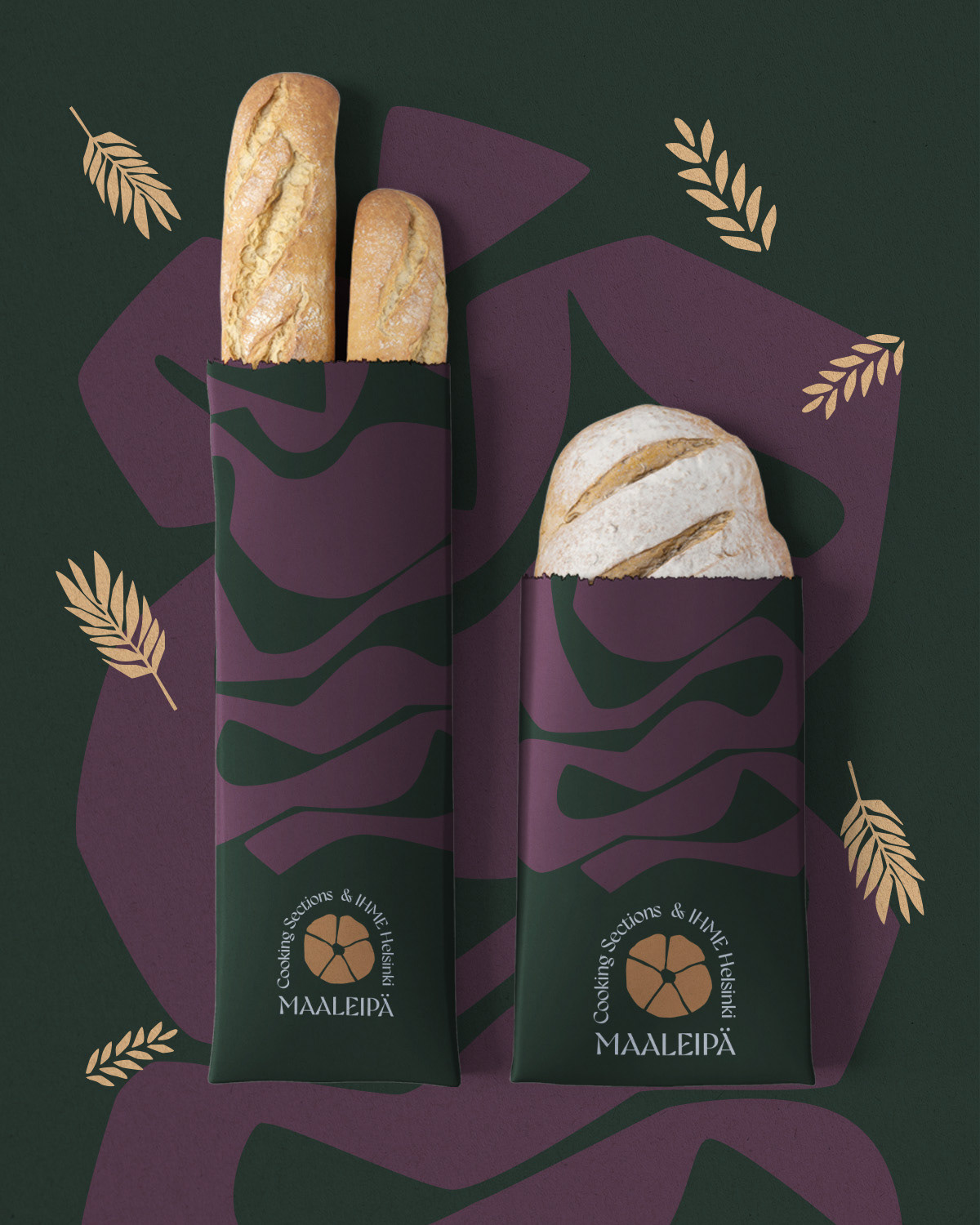
Animal prints and bright colours have been catching my attention, first unconsciously and recently more consciously. At the same time my sad little watercolour set was crying out of neglect. After several fun hours of experimenting on Photoshop I was ready to slab this deliciously haptic print of different colours and add typography (which of course had to be a funky 70s serif). Tada!