Album cover art by Bráulio Amado & Scott Gelber
A year and a half in the advertising industry, working at an agency, working for clients, has lead to a variety show of comment rounds for the most particular, and not rarely ridiculous, reasons. The client is always right and I do genuinely believe that when it comes to matters of their company and the products or services they provide. There’s slim chance I’d ever comprehend their business on the level the client themselves do. I, as a designer, however, do comprehend the factors of branding and how it shouldn’t revolve around a single person’s favourite colour. I think most designers have been there, professional enough to keep a straight face.
, it has been enough time by now for me to proudly admit that for years Futura was my, like so many others’, favourite font and for a while I refused to use anything but. Granted, that was back in upper secondary and university where most of what I created and used typefaces for were my own projects: op-eds, presentations, pitch decks and so forth. One could argue my, what they call, personal brand was heavily based on and around this particular sans serif also favoured by my idols such as Wes Anderson. The younger self’s only defence was that I did try to incorporate other typefaces in my work but no other compared. This mindset shifted drastically and, I hope, indefinitely once I started my first Agency job. Suddenly the aesthetic horizon of mine was broadened into a vast, ever-growing universe, where no typeface, just like no colour nor shape, is superior but individual with changing meanings depending how combined with others. They did tell me this in uni, I did know this, I just thought I knew a little better.
The absolute best part of agency-based client work is that each time I get to do something completely different. I don’t have to be married to a specific font and colour scheme and keep implementing those to every project. The work can and should look like the client or the revamped version of it while still being distinctively my work. What I am trying to say is that where actors get to play different people, I get to live in different aesthetics and what a richness to a visually minded person that is!
My brain, much like so many other designer’s, feeds of versatility. Looking at the same thing dulls the mind while different visual identities make the brain juices running, almost automatically turning the cogwheel and producing new ideas. Yet when Iittala rebranded a month or so ago now, I was devastated among my peers. It seemed like, for a week, the whole country was upside down, upset about an icon being tossed in the bin. In reality not many people outside the industry didn’t really care. It’s not like this country hasn’t seen a heritage label rebrand before. Just hasn’t been quite this drastic. The new look wasn’t bad, despite the logo’s plagiarism allegations and seemingly obscure kerning, and the reasoning behind needing to rebrand was legitimate. There were lengthy conversations at work and heated debate online that were, if nothing else, entertaining and educational to follow.
I suppose, with Iittala, it was about the scale of it. We’re not talking about some small brick-and-mortar boutique at the corner of some town – we’re talking about a household name that is almost alarmingly embedded in our culture. Come to think of it, it’s difficult to imagine a completely successful way to completely rebrand Iittala. I saw someone compare the project to Marimekko's rebrand, pointing out how heritage brands are about longevity and recognisability, showing how these types of rebrands don’t necessarily need to reinvent the wheel but instead elaborate and enhance what already exists. We’ve seen this many times abroad and it feels natural. Hard to say if it was Iittala’s wish to shake things at this scale, to disrupt and change direction, but that’s how it plaid out to the public. We’ve seen this, too, many times abroad. I’m not going to lie and say that, while in no financial position to actually shop at Burberry, I remain gutted they, too, downgraded to a boring sans serif and left the gorgeous mounted knight in the past.
Well aware it’s in my personality’s and, consequently, my job’s nature to care about these things more than an Average Joe ever should, and while there’s wars, famine and cancer among other very real pressing issues, nobody’s gonna die over an unsuccessful rebrand. Safely in my industry’s bubble, it’s still frustrating to witness good design pitches butchered by clients based on the fact it’s not someone’s favourite colour. As noted in the very beginning, the client is always right when it comes to their business, but so is a skilled designer when it comes to communicating the brand, not the people behind it. I cannot know what went on behind the scenes in the process of rebranding Iittala, but I aim to convince my clients with clear reasoning, meeting in the middle when needed and understanding when I have gone down the wrong road. If my reasoning is valid the client should trust in me. Likewise, if the client’s reasoning is valid, I should trust them.
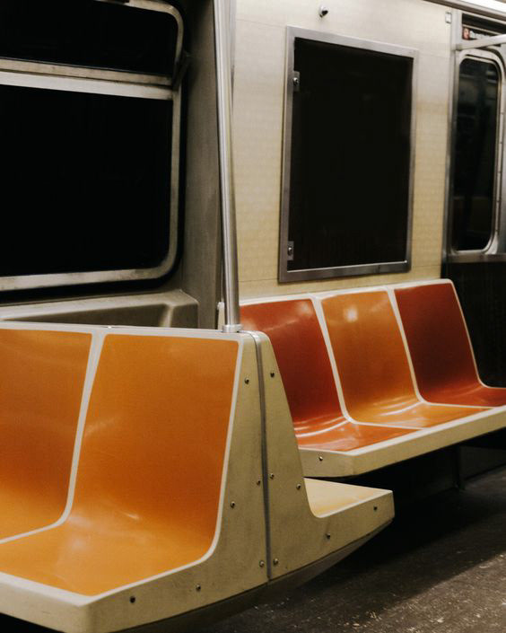
Finally we arrive back to favourites. I moved on from Futura, but there’s a very special place for the font family in my heart, ready to be reminisced on special occasions. My personal brand, the one you see here, on my socials and if you’ve ever received a résumé or an open letter from me, has evolved steadily during the years – as it should. There’s a place for favourite colours and this is it! When I sell my skills I, essentially, sell a skilled persona excited to jump on new projects and approach them in my own unique way. That should translate through every professional touchpoint and is not only allowed but, I think, expected to look like me. So it’s orange. As an homage to my aesthetics roots in my teens, it’s a little Wes Andersonian. What was fun to notice while updating my portfolio was that all my client work carries the tiniest hints of some of this with it, like an imprint. Individually though, even I didn’t notice.

